Discover the vital role of UX in web development and how it boosts business results. Enhance your site’s performance and user satisfaction today!
The role of UX in web development for business results

TL;DR:
- User experience is essential for building trust and increasing conversions on small business websites.
- Effective UX integrates research, prototyping, testing, and edge case planning throughout web development.
- Collaboration between designers and developers using shared tools and systems ensures a cohesive, user-focused site.
A beautiful website that frustrates visitors is an expensive mistake. Many small businesses invest heavily in visual design, only to watch their bounce rates climb and enquiries stagnate. The problem is rarely the colour palette or the photography. It is the experience underneath: how quickly pages load, how clearly information is presented, and whether users can actually do what they came to do. Understanding how user experience fits into web development is not a luxury reserved for large enterprises. It is the baseline for any site that needs to perform commercially.
Table of Contents
- Why UX matters in web development
- Key UX processes in the web development lifecycle
- Edge cases and challenges: designing for the real world
- Collaboration: how UX designers and developers work together
- What most web projects get wrong about UX
- Take your next step towards user-focused web development
- Frequently asked questions
Key Takeaways
| Point | Details |
|---|---|
| UX drives results | A focus on user experience can significantly increase engagement and conversion rates for any business website. |
| UX is a process | From user research to post-launch updates, effective UX requires an ongoing, iterative approach. |
| Handle edge cases | Anticipating errors and rare scenarios is critical for building trust in your website. |
| Collaboration is essential | Good communication between designers and developers ensures your site is both beautiful and usable. |
Why UX matters in web development
User experience, or UX, describes everything a visitor feels and does when they interact with your website. It covers navigation, page speed, accessibility, layout logic, error messages, and the path from landing to conversion. It is not the same as user interface design, which focuses primarily on how a site looks. UX is about how a site works for the person using it.
The distinction matters enormously. A site can be visually striking and still lose customers at every step. Buttons that are hard to find, checkout flows that require too many clicks, or content that is buried three levels deep in a menu. These are UX failures, and no amount of beautiful imagery will compensate for them.
“Form follows function” is an old design principle, but it holds particularly true online. Aesthetics attract attention, but functionality keeps users moving towards conversion. When the two conflict, function must win.
For small businesses and agencies, the commercial case for UX is straightforward. A site that users find intuitive builds trust quickly. Trust leads to enquiries, purchases, and return visits. Poor UX does the opposite. It creates friction, signals unprofessionalism, and pushes potential customers towards a competitor with a cleaner experience.
UX for local business sites confirms that local and small-scale businesses often underestimate how directly usability affects lead generation. A plumber whose website makes it difficult to find a phone number loses work to one whose contact details are visible within seconds of landing.
Common UX mistakes that small business websites make include:
- Over-emphasising aesthetics at the expense of speed and clarity
- Ignoring mobile users, who now account for the majority of web traffic in most sectors
- Cluttered navigation with too many options and no clear hierarchy
- Weak calls to action that leave users unsure what to do next
- Slow load times caused by unoptimised images or excessive scripts
- No clear value proposition visible above the fold on any key page
UX is integrated into web development through methodologies like User-Centred Design (UCD), iterative prototyping, and Agile sprints that include UX tasks at every cycle. This means UX is not a single phase that happens before development. It runs alongside coding, testing, and deployment. That integration is what separates sites that work from sites that simply exist.
If your business relies on a client-facing web platform, understanding how client portal benefits are shaped by UX decisions is a practical starting point for improving satisfaction and retention.
Key UX processes in the web development lifecycle
Knowing that UX matters is one thing. Understanding how it is actually built into a project is another. The UX lifecycle in web development follows a clear sequence, though in practice the stages overlap and repeat.
Here is a straightforward overview of the main stages:
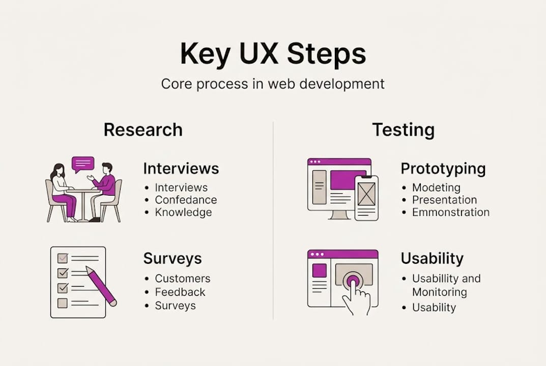
- Discovery and user research — Interviews, surveys, and analytics review to understand who your users are, what they need, and where they currently struggle.
- Information architecture — Organising content so it makes intuitive sense to a visitor, not just to the business owner.
- Wireframing — Creating low-fidelity sketches of page layouts before any visual design is applied.
- Prototyping — Building interactive mockups that simulate user journeys without writing production code.
- Usability testing — Observing real users attempting real tasks to identify friction points before launch.
- Developer handoff — Passing design specifications clearly to the development team, with documented standards and annotated assets.
- Post-launch iteration — Collecting data from live users, identifying drop-off points, and making continuous improvements.
Key UX process steps in web development include user research through interviews and surveys, wireframing, prototyping, usability testing, design handoff to developers, and post-launch iteration. Skipping any one of these stages creates a gap that shows up later as a usability problem.
| Stage | What it involves | Common mistake |
|---|---|---|
| User research | Interviews, analytics, surveys | Skipping it to save time |
| Wireframing | Layout planning without visual design | Jumping straight to high-fidelity |
| Prototyping | Interactive mockups for testing | Treating it as optional |
| Usability testing | Watching real users navigate | Testing only with colleagues |
| Developer handoff | Documented specs and assets | Handing over incomplete files |
| Post-launch iteration | Analytics, feedback, and updates | Treating launch as the finish line |
User research is where the most insight is generated and, paradoxically, where the most budget is cut. Businesses assume they know their customers. In reality, the assumptions rarely survive contact with actual user behaviour. Even a small number of structured user interviews can reveal navigation problems, confusing terminology, or missing content that would otherwise only surface through lost conversions.
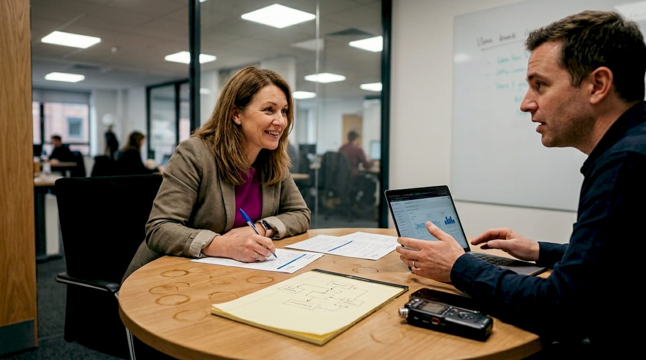
Web usability essentials make clear that usability is not a subjective preference. It is a measurable quality. Tasks either get completed or they do not. Paths either feel natural or they create confusion. Measuring these outcomes is what separates informed design decisions from guesswork.
Pro Tip: When reviewing a developer’s previous work, look beyond the visual finish. Ask how UX was integrated at each stage. Good developer portfolios will show evidence of thinking through user journeys, not just delivering polished screenshots.
Edge cases and challenges: designing for the real world
A well-structured UX process covers the happy path: the ideal user who finds your site, reads the content, clicks the call to action, and converts. But real users do not always follow the happy path. They mistype URLs, hit empty search results, lose their session mid-form, or encounter permission errors they do not understand. How your site handles these moments defines whether users stay or leave.
Edge cases are the uncommon scenarios that fall outside the standard user journey. In UX terms, designing for edge cases involves planning for empty states, error handling, partial data loading, permissions conflicts, and multiple interface states such as loading indicators, restricted access messages, and timeout warnings.
Here is why this matters commercially. A user who encounters a blank page with no explanation assumes the site is broken. A user who sees a clear message like “No results found. Try a broader search” understands what happened and stays engaged. The difference is a few lines of thoughtful copy and a well-considered UI state. But the impact on trust and retention is significant.
Consider these practical examples of edge case handling:
- Empty search results — Show a helpful message with suggestions rather than a blank container
- Form validation errors — Highlight the specific field and explain what needs correcting, not just that something went wrong
- 404 pages — Include navigation options and a search bar so users can recover, rather than hitting a dead end
- Session timeouts — Warn users before their session expires and preserve their progress where possible
- Permission-restricted content — Explain why access is blocked and what the user needs to do to gain access
| Scenario | Poor handling | Well-handled |
|---|---|---|
| Empty search results | Blank page | Message with suggestions |
| Form validation error | Generic “Error” alert | Field-specific guidance |
| 404 page | Default server error | Branded page with navigation |
| Session timeout | Silent logout | Warning with data preservation |
| Restricted content | Blank area | Clear explanation with next steps |
The investment in edge case planning is modest compared to the cost of users losing confidence in your platform. Projects like Casefile demonstrate how careful attention to these scenarios produces systems that hold up under real-world usage, not just idealised conditions. When a site handles the unexpected gracefully, it signals professionalism and reliability.
Collaboration: how UX designers and developers work together
Even the most carefully considered UX process falls apart without effective collaboration between the people designing the experience and the people building it. This is one of the most common failure points in web projects, particularly for smaller teams working without a formal process.
UX engineers occupy the bridge between design and development. They understand both the principles of user experience and the technical constraints of building for the web. They ask questions like “Can we animate this transition without impacting load time?” or “Does this component pattern already exist in our design system?” Without someone playing this bridging role, design intent often gets lost in translation.
UX engineers bridge design and development using tools like Figma and Zeplin for handoff, design systems for consistency, and a working awareness of technical constraints during the design phase itself. The result is fewer surprises at the build stage and less back-and-forth between teams.
Key tools and practices that support effective collaboration include:
- Figma — The dominant tool for collaborative interface design, allowing developers to inspect dimensions, colours, and assets directly
- Zeplin — Focused specifically on developer handoff, with annotated specs and style guides
- Design systems — Shared libraries of components with agreed standards, reducing inconsistency across pages and teams
- Documented handoff reviews — Structured sessions where designers walk developers through key interactions, animations, and responsive behaviours
- Shared terminology — Agreeing on consistent naming conventions for components reduces confusion and speeds up development
Balancing design intent with development feasibility is a practical skill. A designer might specify a complex animation that degrades on lower-end devices. A developer working in isolation might simplify it without informing the designer. Regular communication prevents these quiet compromises from undermining the finished product.
Real collaboration also means developers giving feedback during the design phase. If a proposed layout is technically expensive to build or will require workarounds that introduce fragility, the developer should say so early. This is far less disruptive than discovering it mid-build.
Pro Tip: Establish a shared component library at the start of any substantial project. It creates a single source of truth for both designers and developers, and it dramatically reduces the number of “wait, which version of this button are we using?” conversations. Projects like B2B Connections illustrate how design system thinking at the outset produces more consistent, maintainable results.
What most web projects get wrong about UX
Most UX advice centres on process: do your research, test with users, iterate often. That guidance is correct. But the deeper problem is a mindset issue that no checklist can fix.
Teams chase visual trends instead of solving user problems. A site built around the latest design aesthetic might look impressive in a portfolio screenshot, but if it relies on unconventional navigation or sacrifices readability for style, real users pay the price. Aesthetics attract but can distract and slow sites, while functionality ensures usability. The balance must always favour the user’s ability to get things done.
The most costly shortcut is skipping real-user testing. Colleagues and clients are not representative users. They know too much about the product to notice what a fresh visitor would find confusing. Even one round of testing with five to eight genuine target users will surface more meaningful issues than weeks of internal review.
Understanding the web design landscape in Swindon and similar local markets makes this clearer. Users in specific sectors and regions have particular expectations. Assumptions built on general best practice often miss those nuances. The only way to know is to watch real people use the site.
Post-launch UX is also chronically under-resourced. Launch day is treated as the end of the project when it should mark the beginning of a feedback loop. Analytics, heatmaps, and user feedback tools provide a constant stream of data about what is and is not working. Ignoring that data is the equivalent of opening a shop and then never speaking to customers again.
Take your next step towards user-focused web development
If this article has clarified how deeply UX shapes web project outcomes, the next question is what to do about it. Working with a developer who understands UX as a technical discipline, not just a design afterthought, changes what your finished site is capable of.
The custom web development services at richharrington.dev are built around this approach. Every project, from fixed-price business websites to complex full stack builds, is developed with user experience integrated at every stage: research, architecture, build, testing, and ongoing improvement. If you are ready to talk through your requirements and find out what a UX-led development process could do for your site, book a free consultation and let’s start from where you actually are.
Frequently asked questions
How does UX impact website conversion rates?
Strong UX design leads to higher conversion rates by making sites intuitive and trustworthy, so visitors are more confident taking action. Good UX directly increases engagement, trust, and the likelihood of conversion.
What are the main steps to integrate UX into web development?
The core steps are user research, information architecture, wireframing, prototyping, usability testing, developer handoff, and post-launch iteration. Each process step builds on the previous, creating a coherent experience grounded in real user needs.
Why do websites need to plan for errors and unusual scenarios?
Designing for edge cases ensures users have a positive experience even when something goes wrong, which builds trust and keeps them on the site. Planning for empty states and error handling is what separates professional sites from fragile ones.
What tools help bridge design and development in UX projects?
Figma, Zeplin, and shared design systems are the most widely used tools for ensuring smooth handoffs and consistent results. UX engineers use these tools alongside a working knowledge of technical constraints to close the gap between design intent and built output.