
Learn the core principles of modular web design and how they improve project efficiency, maintainability, and user experience for developers of all team sizes.
Elevate project efficiency with modular web design

TL;DR:
- Modular web design involves building sites from reusable, independent components for better maintainability.
- It improves efficiency by enabling reuse, simplifying updates, and reducing regression risks.
- Tools like Storybook aid in developing, testing, and governing modular components across projects.
Modular web design is often dismissed as something only large engineering teams need to worry about. That assumption costs smaller teams time, money, and maintainability. The truth is that modularity, which means building a site from independent, reusable components rather than one tangled codebase, is just as powerful for a two-person agency as it is for a Fortune 500 product team. This article breaks down the core principles, shows you the real efficiency gains, and walks through practical tools and techniques you can apply immediately, whether you are working on a client site, a SaaS product, or your own portfolio.
Table of Contents
- Key principles of modular web design
- Advantages of modular web design for project efficiency
- Composing modules: Tools and best practices
- Responsive modularity: Adapting modules for every device
- A fresh perspective: What most guides miss about modular web design
- Explore modular web solutions with Rich Harrington
- Frequently asked questions
Key Takeaways
| Point | Details |
|---|---|
| Modularity boosts efficiency | Using modular design principles saves time and makes updates easier for web teams. |
| Reuse and consistency matter | Creating self-contained, reusable modules ensures a consistent user experience in every project. |
| Avoid micro-frontends pitfalls | Most teams benefit more from modular monoliths than complex micro-frontend architectures. |
| Governance prevents fragmentation | Setting clear standards and processes helps keep modular web projects cohesive and maintainable. |
| Responsive modules are vital | Ensuring modules adapt independently to devices improves usability across all screen sizes. |
Key principles of modular web design
Modularity in web design context means organising your project into discrete, self-contained units that each handle one specific concern. Think of it like building with standardised bricks rather than pouring a single slab of concrete. Each brick fits anywhere, can be replaced without disturbing the others, and is easy to inspect on its own.
The design principles that underpin this approach include encapsulation, standardised interfaces, independence, low coupling, high cohesion, reusability, and adherence to a design system. These are not abstract ideals. They are practical decisions you make at the component level every single day.
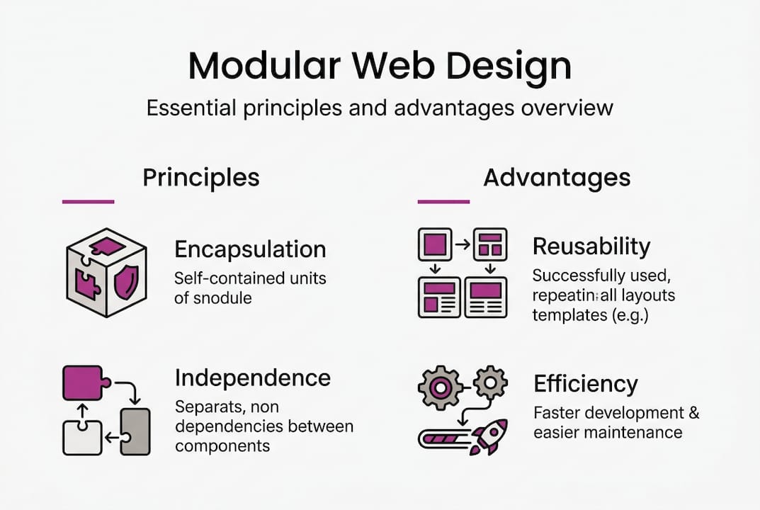
Encapsulation means a module owns its own styles, logic, and markup. Nothing leaks out, and nothing unexpected leaks in. Independence means a button component does not care whether it lives inside a modal or a hero section. Low coupling means changing one module does not cascade failures through the rest of the project. High cohesion means everything inside a module is there for a reason.
Consistency in grids, typography, and colour systems is what ties modules together visually without making them dependent on each other structurally. A well-defined spacing scale and type system means any module you drop into a layout will feel at home.
“The foundation of modular design is not technology. It is discipline. Consistent naming, clear boundaries, and shared standards are what make a component library genuinely reusable.”
Here is a quick summary of the core principles:
- Encapsulation: Styles and logic are scoped to the module
- Standardised interfaces: Modules communicate through defined inputs and outputs
- Independence: Each module works without relying on another module’s internals
- Low coupling: Changes in one module do not break others
- High cohesion: Everything inside a module serves one clear purpose
- Reusability: Modules can be used across multiple contexts without modification
- Design system consistency: Shared tokens for colour, spacing, and typography
| Concept | What it means in practice |
|---|---|
| Encapsulation | Scoped CSS, isolated component state |
| Low coupling | No direct imports between unrelated modules |
| High cohesion | One component, one job |
| Reusability | A card component works in any layout |
| Standardised interface | Props or data contracts define how modules connect |
Advantages of modular web design for project efficiency
Understanding the principles leads us to the next question: how does modularity actually impact project efficiency?
Modular design enables reusability and maintainability, helping web teams deliver projects more efficiently. When you build a navigation component once and reuse it across twenty pages, you are not just saving time on initial build. You are also ensuring that a single fix propagates everywhere instantly.

Here is how modular and traditional workflows compare side by side:
| Factor | Traditional approach | Modular approach |
|---|---|---|
| Bug fixing | Hunt through page-specific code | Fix once in the module |
| Onboarding | Read entire codebase | Learn the component catalogue |
| Design updates | Edit multiple files | Update one shared token or component |
| Testing | Full regression on every change | Test the affected module in isolation |
| Scalability | Gets harder as the project grows | Scales naturally with new modules |
The efficiency gains are not just theoretical. Teams using component-driven workflows report faster handoffs between design and development, fewer regression bugs, and more predictable delivery timelines. You can see this kind of thinking applied in a real modular project where structured components made iterative updates far simpler.
Key benefits at a glance:
- Faster development cycles through component reuse
- Easier onboarding for new team members
- Reduced regression risk when updating shared components
- Cleaner separation between design and logic
- Better scalability as projects grow
- Improved portfolio impact when you can demonstrate consistent, structured builds
Pro Tip: Before starting a new project, audit your existing components. Even three or four well-tested, reusable modules can dramatically cut your initial build time and reduce the chance of introducing new bugs.
Composing modules: Tools and best practices
With the benefits established, let us examine how to put modularity into practice, from setup to governance.
The most practical starting point for most teams is component-driven development. Start with Storybook for component-driven workflows and prioritise a modular monolith over micro-frontends for most team sizes. Storybook lets you build, document, and test components in complete isolation before they ever touch a real page.
Here is a straightforward process for getting started:
- Audit your existing work. Identify repeating patterns in your current projects, such as cards, buttons, form fields, and navigation bars.
- Define your design tokens. Establish colour, spacing, and typography values as variables before writing a single component.
- Build in isolation. Use a tool like Storybook to develop each component without the context of a full page.
- Document as you go. Write usage notes for each component so future contributors know when and how to use it.
- Establish governance rules. Decide who can create new components, how they are named, and when an existing module should be extended versus replaced.
- Review regularly. Schedule periodic audits to retire duplicate components and keep the library lean.
Governance is the part most teams skip, and it is the part that kills component libraries. Without clear rules, you end up with seventeen slightly different button variants and no one knows which one to use.
“Most teams do not need micro-frontends. They need better discipline around the monolith they already have. Complexity added prematurely is just technical debt with a marketing name.”
For tools for modular design, the principle is the same: choose tools that enforce boundaries and make reuse easy, not tools that add layers of infrastructure before you have earned the complexity.
Pro Tip: Create a simple governance document, even just a one-page README, that defines naming conventions, folder structure, and the process for adding new components. It takes an hour to write and saves days of confusion later.
Responsive modularity: Adapting modules for every device
Now, let us tackle the crucial challenge of ensuring modular designs adapt seamlessly to all environments and devices.
Modularity applies beyond UI to full-stack concerns, and using intrinsic or container queries for responsive modules is one of the most powerful techniques available to modern developers. Container queries are a significant shift from traditional media queries. Instead of asking “how wide is the viewport?”, a container query asks “how wide is the space this component lives in?” That is a much better fit for modular design, where the same component might appear in a narrow sidebar or a full-width section.
Strategies for device adaptability in modular projects:
- Use container queries to make components self-responsive, independent of their parent layout
- Define breakpoints at the component level, not the page level
- Test each module across multiple container widths before integrating it into a page
- Separate interface logic from data logic so modules can be reused across web, mobile web, and progressive web apps
- Use fluid type and spacing scales so components adapt gracefully without hard breakpoints
You can see this approach in action across projects like Fleming Partners, where component-level responsiveness made cross-device delivery straightforward. Similar principles applied to agency projects and consultancy web builds show how the same modular foundation scales across very different client contexts.
Pro Tip: Focus on responsiveness at the module level first. If every component handles its own layout gracefully, your page-level layout becomes much simpler and your code stays clean.
Full-stack modularity extends this thinking beyond the browser. When your interface components are decoupled from your data-fetching logic, you can swap out API endpoints, change rendering strategies, or migrate frameworks without rewriting your UI. That is a significant long-term advantage.
A fresh perspective: What most guides miss about modular web design
Having explored the technical side, let us step back and reconsider how modularity plays out in real day-to-day design and development.
Most articles about modular web design spend a disproportionate amount of time on micro-frontends, distributed systems, and enterprise-scale component platforms. For the vast majority of designers and developers, that is the wrong conversation. The practical wins come from disciplined component organisation, shared design tokens, and clear governance within a single, well-structured project.
The uncomfortable truth is that complexity is often mistaken for sophistication. Teams adopt micro-frontend architectures because they sound modern, then spend months wrestling with runtime coupling and deployment pipelines instead of shipping features. The developer portfolio lessons that matter most are not about which architecture you used. They are about whether the project was maintainable, delivered on time, and easy to hand over.
The web design landscape insights confirm that clients and agencies value reliability and speed above architectural purity. Governance and simplicity are not compromises. They are the actual goal.
Explore modular web solutions with Rich Harrington
Armed with this knowledge and perspective, you are ready to make modular design work for your next project. Here is how to take it further.
If you want to see modular thinking applied to real client work, the portfolio at richharrington.dev covers everything from custom modular websites built for small businesses and trades through to SaaS modular builds designed to scale. Whether you need a structured component-driven site from scratch, a review of your existing architecture, or a senior developer to help your team implement a proper design system, there is a straightforward path to getting started. Reach out directly to discuss your project requirements.
Frequently asked questions
How does modular web design differ from traditional web design?
Modular web design uses interchangeable, reusable components with defined interfaces and independence, whereas traditional design often relies on bespoke, tightly coupled code that is harder to maintain and update.
What tools help teams achieve modular web design?
Tools like Storybook and component libraries make it straightforward for teams to build, test, and reuse modules in isolation before integrating them into full pages.
Can modular web design improve site performance?
Yes. Reusability and maintainability reduce duplicate code and make targeted updates easier, which results in faster load times and fewer bugs reaching production.
What is the risk of using micro-frontends?
Micro-frontends can introduce runtime coupling and overhead if adopted prematurely. Most teams achieve better results with a well-governed modular monolith.